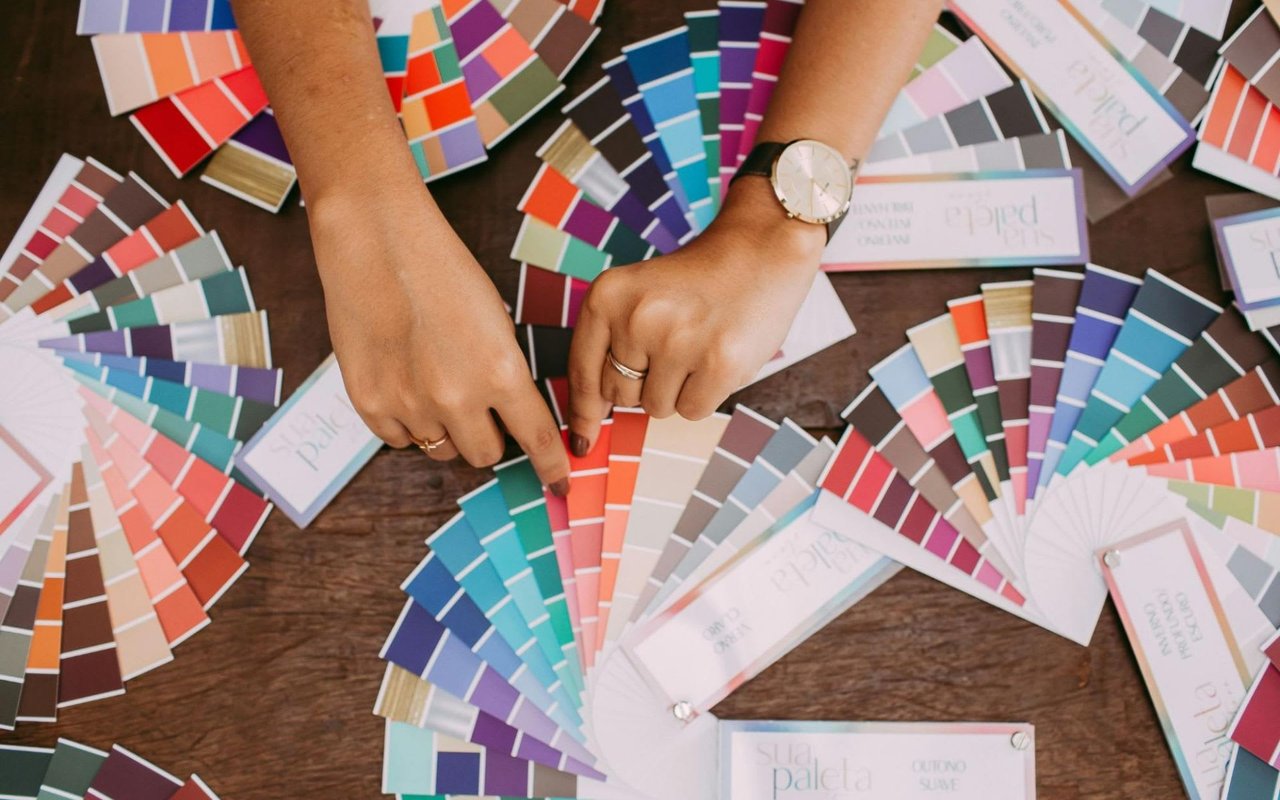
The colors you choose for your home's interior can significantly impact the overall ambiance and your mood. The science of color, or color psychology, plays a vital role in interior design, as different hues can evoke various emotions and set the tone for each room. Whether you're looking to create a calming sanctuary in the bedroom, an energizing workspace, or a welcoming living area, understanding the effects of color can help you make informed decisions. Here’s a guide to choosing the right paint tones for every room in your home.
Living Room: Warm and Inviting Tones
The living room is often the heart of the home, serving as a gathering place for family and friends. It's a space where you want to feel comfortable, relaxed, energized, and sociable. To achieve this balance, consider warm, inviting colors that create a welcoming atmosphere.
Warm tones like soft yellows, warm grays, and neutral beiges can make the living room feel cozy and inviting. These colors provide a subtle backdrop that allows furniture and decor to stand out. If you prefer a bolder look, shades of terracotta, burnt orange, or deep red can add warmth and vibrancy, encouraging conversation and interaction. These hues stimulate the senses and create a lively ambiance, making them ideal for entertaining spaces.
To maintain harmony in the living room, it’s essential to consider the size and natural light of the space. Lighter tones can help make a small or dimly lit living room feel more open and airy, while darker, richer colors can add depth and sophistication to larger rooms.
Kitchen: Fresh and Energetic Hues
The kitchen is often the busiest room in the home, where people gather to cook, eat, and socialize. Choosing the right color for this space can help create a lively and functional atmosphere. Colors that evoke a sense of freshness and energy work well in the kitchen.
Bright, crisp colors like white, light gray, and pale blue can create a clean and open feel, making the kitchen appear larger and more inviting. These colors reflect light and can make the space feel bright and airy. White is a classic choice for kitchens, offering a timeless look that complements various modern and traditional styles.
For those who want to introduce more color, consider shades of green, yellow, or even a bold pop of red. Green, particularly soft sage or mint, is known for its calming and rejuvenating properties, bringing a touch of nature indoors. Yellow can add a cheerful and sunny vibe, making the kitchen feel warm and welcoming. Red, used as an accent, can stimulate appetite and add a sense of drama.
Bedroom: Calming and Restorative Shades
The bedroom is a personal retreat, a place for rest. To create a serene environment conducive to sleep, choosing colors that promote calmness and tranquility is important. Cool tones and muted shades are often the best choices for this space.
Soft blues, pale greens, and gentle lavenders are excellent bedroom options. These cool colors are associated with peace and relaxation, helping to lower stress levels and create a soothing atmosphere. Blue, in particular, is known for its calming effect on the mind and body, making it one of the most popular bedroom colors. Light shades of blue can make the room airy and open, while deeper blues add depth and luxury.
Neutral tones like soft grays, taupes, and blush tones can create a peaceful bedroom environment. These colors are versatile and easy to pair with various bedding and decor styles. Neutrals can serve as a subtle backdrop, allowing you to introduce pops of color through accessories or artwork without overwhelming the space.
Bathroom: Spa-Inspired Tones
The bathroom is a place for relaxation and self-care; the right color palette can transform it into a spa-like sanctuary. Light, cool colors, and neutral tones are often favored in bathroom design for their clean and calming effects.
Soft shades of blue, green, and gray can evoke a calm and freshness reminiscent of water and nature. Light blue and aqua tones create a tranquil and refreshing atmosphere, while pale green brings a touch of nature into the space. Gray, especially with white accents and natural materials, offers a sleek, modern, serene look.
For a more luxurious feel, consider using white or off-white tones. White bathrooms have a timeless appeal and convey a sense of cleanliness and simplicity. Incorporate natural textures such as wood, stone, or bamboo to add warmth and depth through cabinetry, flooring, or accessories.
Home Office: Productive and Focused Colors
With more people working from home, the home office has become an essential space that requires careful consideration regarding color choice. The goal is to create an environment that enhances focus, productivity, and creativity.
Cool colors like blue and green are known to promote concentration and calmness, making them excellent choices for a home office. Blue is particularly effective for enhancing focus and mental clarity, while green, associated with balance and harmony, can reduce stress and create a refreshing workspace. Opt for muted shades to avoid overstimulation, especially if you spend long hours in the office.
For a boost of creativity and energy, consider incorporating accents of yellow or orange. These warm, stimulating colors can enhance mood and motivation, making them ideal for creative tasks. However, they should be used sparingly to prevent overwhelming the space. A neutral backdrop, such as soft gray or beige, can provide a balanced foundation, allowing vibrant accents to shine without distraction.
Dining Room: Elegant and Engaging Hues
The dining room is a space for gathering and enjoying meals, so the color palette should evoke a sense of warmth, elegance, and friendliness. Warm, rich tones can create an inviting and sophisticated dining environment.
Deep reds, burgundies, and warm earth tones stimulate appetite and conversation, making them popular choices for dining rooms. These colors add a sense of intimacy and drama, creating cozy and elegant meal settings. If you prefer a lighter palette, shades of beige, soft gold, or warm grays can provide a neutral yet engaging backdrop that enhances the dining experience.
Consider using deep blues or charcoal grays to create a more contemporary dining space. These colors convey a sense of luxury and sophistication, especially when paired with metallic accents like gold or silver and rich textures like velvet or leather.
Transform Your Home with the Right Colors
The colors you choose for each room in your home can profoundly impact the atmosphere and how you feel in the space. By understanding the science of color and considering the function of each room, you can create a harmonious and personalized environment that reflects your style and enhances your daily living experience.
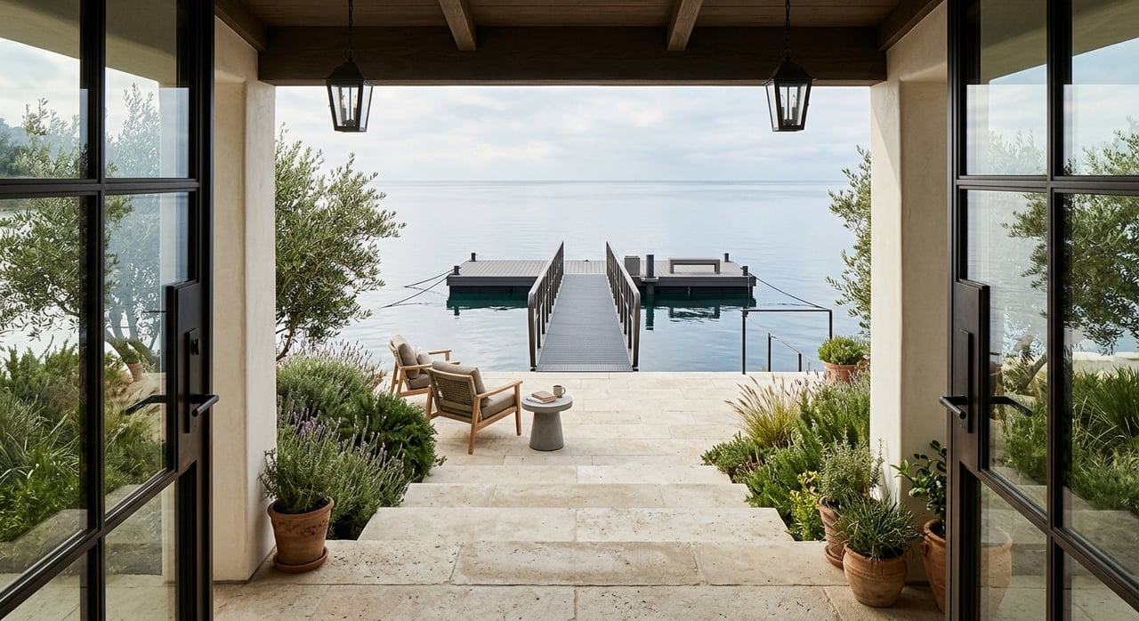
Contact Phillipa Criswell today if you want to explore real estate in Belvedere. Her expertise in Belvedere real estate can help you find a home that suits your lifestyle and design preferences.